Customising Data View Charts
The properties of each chart can be amended to meet your requirements. The Chart Properties panel is displayed by default in Design mode or in Design Slim mode by clicking the right-hand arrow at the top of the Chart toolbar. For more information, refer to Changing the Data View Display Mode.
The Chart Properties panel consists of three key sections:
| 1. Common |

|
| 2. Default Series |

|
| 3. Axes and other series |

|
Common Properties
The following settings can be applied. Click the setting name for more information.
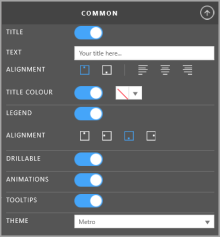
| Title | Toggle on to display a title on the chart. If the switch is turned off, the Text, Alignment and Title Colour options are hidden. |
| Text | Enter the title for the chart. |
| Alignment | Choose where you want the title to appear from the Alignment section by selecting the required icons. From left to right, the icons are - display at the top, display at the bottom, align left, align centre, align right. |
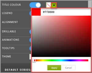
| Title Colour | The title is displayed in grey by default, but you can change the colour by turning the Title toggle switch on then clicking the swatch drop-down arrow and picking a colour (you can enter a hex value, e.g. #ff0000 if known). |
| Legend | Toggle on to display a legend for the chart. |
| Alignment | Choose where the legend is displayed by clicking the applicable alignment icon. |
| Drillable | Toggle on to drill down into the chart. |
| Animations | Toggle on to show the chart switching from one state to another. |
| Tooltip | Toggle on to display tooltips over chart data points. |
| Theme | Choose preset chart colour themes from the Theme drop-down list. |
Default Series Properties

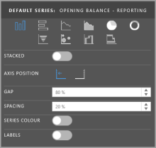
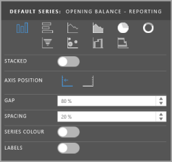
These properties allow you to specify a chart type as well as specific formatting for the default series (the first left-hand column in your data). The most common properties are described below. For any other properties, hover over the property label to view a tooltip.
| Chart Type | Select the type of chart you want to display. For more information, refer to Creating Charts (Visual Data Discovery). |
| Stacked | Only available for certain chart types. Toggle on to display the data in a stack. If selected, an additional toggle switch (Stacked 100% ) can be turned on to show data points as a percentage against the total for the category. |
| Axis Position | Select which axis the series will be plotted against. |
| Gap | Only visible for some chart types. Specify the distance between categories expressed as a percentage of the bar width. |
| Spacing | Only visible for some chart types. Specify the distance between series points in a category expressed as a percentage of the bar width. |
| Series Colour | Toggle switch to select a different colour for the series. |
| Labels | Toggle on to show series labels. Additional options are then displayed. Format : Determines the number format of the labels and defaults to auto. Format : Determines the number format of the labels and defaults to auto. You can change the setting by entering the applicable number type followed by the number of decimal places. Number Currency Percentage Exponential For example, n3 would produce 123.123 whereas n1 would give 123.1. Date formatting follows the same principles as Microsoft Excel eg. ddmmyyyy. Position: Determines the label position (this will vary based on the type of chart).  Label Colour: Toggle on to specify a colour for the label.  |
Axes and Other Series

This section has three parts, Other Series properties, Value Axis properties and Category Axis properties. The properties for each vary depending on the series/axis chosen. Hover over the property label for a tooltip providing more information.