Creating Charts (Visual Data Discovery)
Once you have created (or selected) a data view, you can now add a chart, if required.
Click the Display Mode icon on the data view toolbar and select Design Slim from the drop-down list.
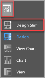
The data view is then displayed in Design Slim mode which adds a chart toolbar on the right-hand side. By default, a simple bar chart is displayed.
The following charts are available:
- Column
- Bar
- Line
- Area
- Pie
- Donut
- Funnel
- Bubble
- Waterfall
You can view the chart properties for each chart by switching to Design mode. For more information, refer toCustomising Data View Charts.
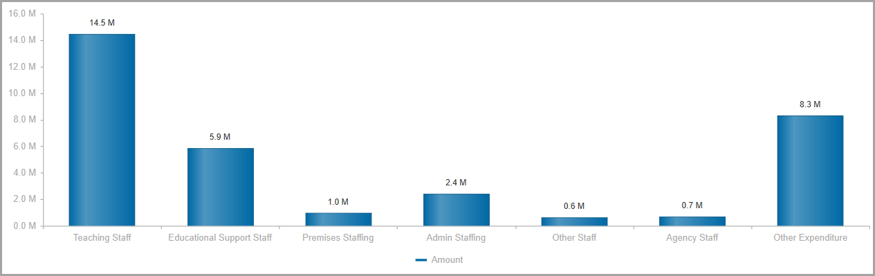
Column
![]()
Column charts are used to compare data from single or multiple data sets. The X axis charts categories and the Y axis charts values, although you can alter the axis position (left or right).
Column charts can be stacked using their chart properties. Stacking allows you to view the proportion of each data point within data sets.
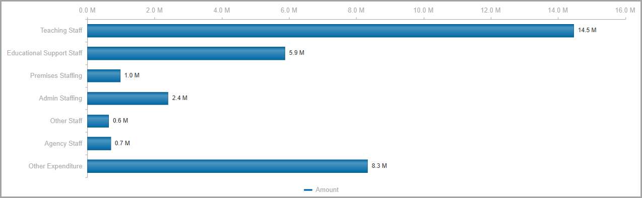
Bar
![]()
Bar charts are used for charting single and multiple data sets. Bar charts appear the same as column charts but are plotted horizontally. They may be preferable over column charts when charting values over extended time periods (due to the flipped axes). They chart all data and can also be stacked in the same way as column charts.
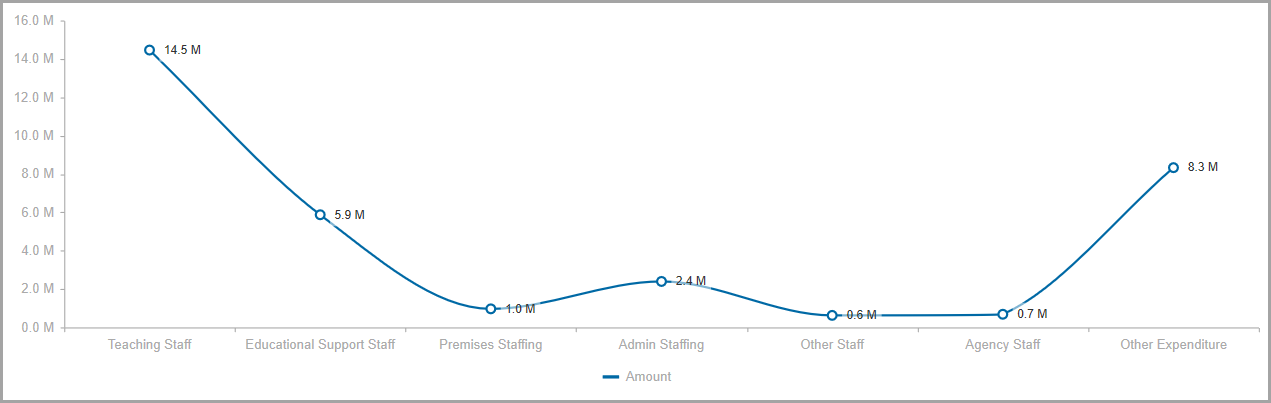
Line
![]()
Line charts are used to demonstrate relationships between data; often to reflect causation. Categories are distributed along the X axis and values across the Y axis. They are the best chart type for plotting a data point over time. They chart all data given.
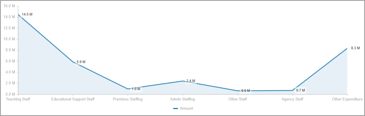
Area
![]()
Area charts depict a line chart with the area beneath the chart filled.
Pie
![]()
Pie charts are useful when comparing proportions within a single data series (showing the relationships of each part within the whole). Comparisons can be made visually by comparing the proportion each sector takes up of the overall space. They are best for one data set separated into multiple categories when your data has no negative or 0 values.

Donut
![]()
Donut charts re similar to pie charts in that they demonstrate the relationship of individual parts to a greater whole. Unlike pie charts however they chart all data, allowing you to chart one data series like a pie chart but adding additional data series (layers), with each data series displayed in a circular ring.

Funnel
![]()
Funnel charts are useful for representing values across a process made up of multiple stages e.g. presenting stages in a sales process. Typically starts at 100% and moves down, depicting values which decrease sequentially, creating a funnel. Funnel charts typically chart one dimension and one data series.

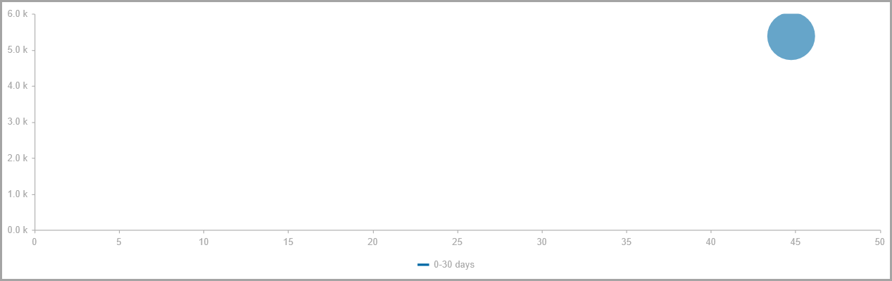
Bubble
![]()
Bubble charts allow you to chart three dimensions of relational data. Typically a bubble chart plots X and Y data like a scatter chart with additional values that determine the size of the value (this is regardless of what data appears in each column). They may have infinite columns, however they only chart the first three columns.
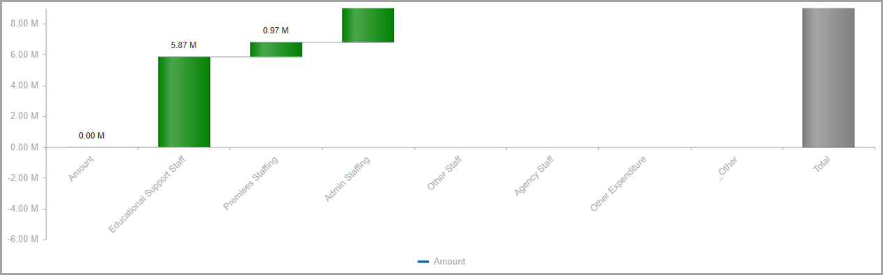
Waterfall
![]()
Waterfall charts are used to demonstrate changes in an initial value (endpoints can be ascending or descending) with a series of intermediate values that appear between end points. e.g. may be used when forecasting profit, beginning with the current values and showing effects of changing input costs. When working with waterfall charts you should have two columns (which make up the start and end values), and multiple rows (which make up the intermediate values which explain the start and end data).