Colour contrast and branding help for administrators
Admins
When adding your organisation's brand colours in the Branding or Custom Login Screen Builder settings, those colours are used across the product for all your employees. Colours that work well in a logo may not always provide enough contrast to be clear on screen.
Checking your colour combinations before applying them can help make sure all your employees can use the product without difficulty.
About accessibility guidelines
The Web Content Accessibility Guidelines (WCAG) set minimum contrast ratios for colours used in digital products. A contrast ratio measures the difference in brightness between two colours, for example, between text and the background behind it.
Buttons and interactive elements
Colours used for buttons need a different minimum contrast ratio against the colours behind or next to them. When applying settings for custom login screens, use the WCAG guidance for non text contrast.
Checking brand colours for accessibility
Contrast checker tools allow you to enter the colour values to find out whether they meet WCAG requirements.
W3C WAI, the organisation that publishes WCAG, maintains a list of contrast checkers. Alternatively, WebAIM's Contrast Checker is widely used and free to access.
You need the hex codes of your brand colours. If you are not sure what the brand HEX colours are, either:
-
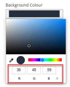
Select the colour option in the Branding or Custom Login Screen Builder page then use the arrows next to the code value to switch between RGB, HSL, or HEX.
- Contact your designer or marketing team who may be able to help.